Graphic design is at the core of my skill set and I’m always designing unique and uniform elements to be used in different projects. As it’s more accessible than other mediums, I tend to spend more of my free creative time designing artwork inspired by others or fun posters for social events.

I listen to music almost 24/7 for different purposes and I’ve compiled a collection of playlists tailored for those very moments and more. I’ve been designing cover art for each playlist, using colours, fonts and effects to reflect the purpose of the playlist.
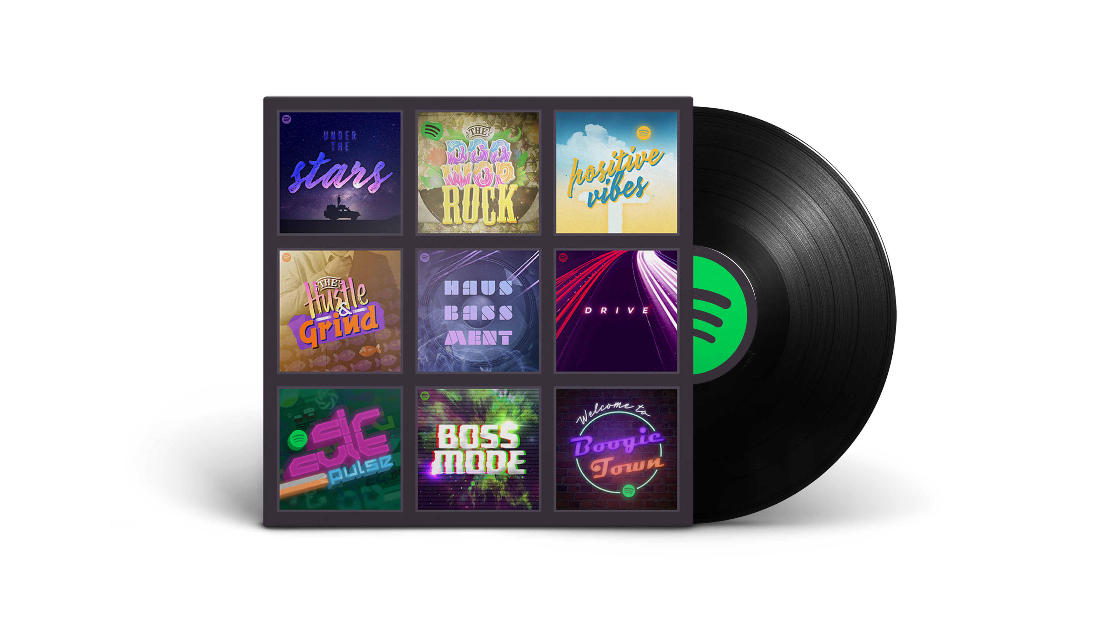

The Doo Wop Rock

Listen on Spotify

“From rock ‘n’ roll to country pop and even a bit of swamp folk, celebrate the adventure of life with The Archies, Fleetwood Mac and Traveling Wilburys.”

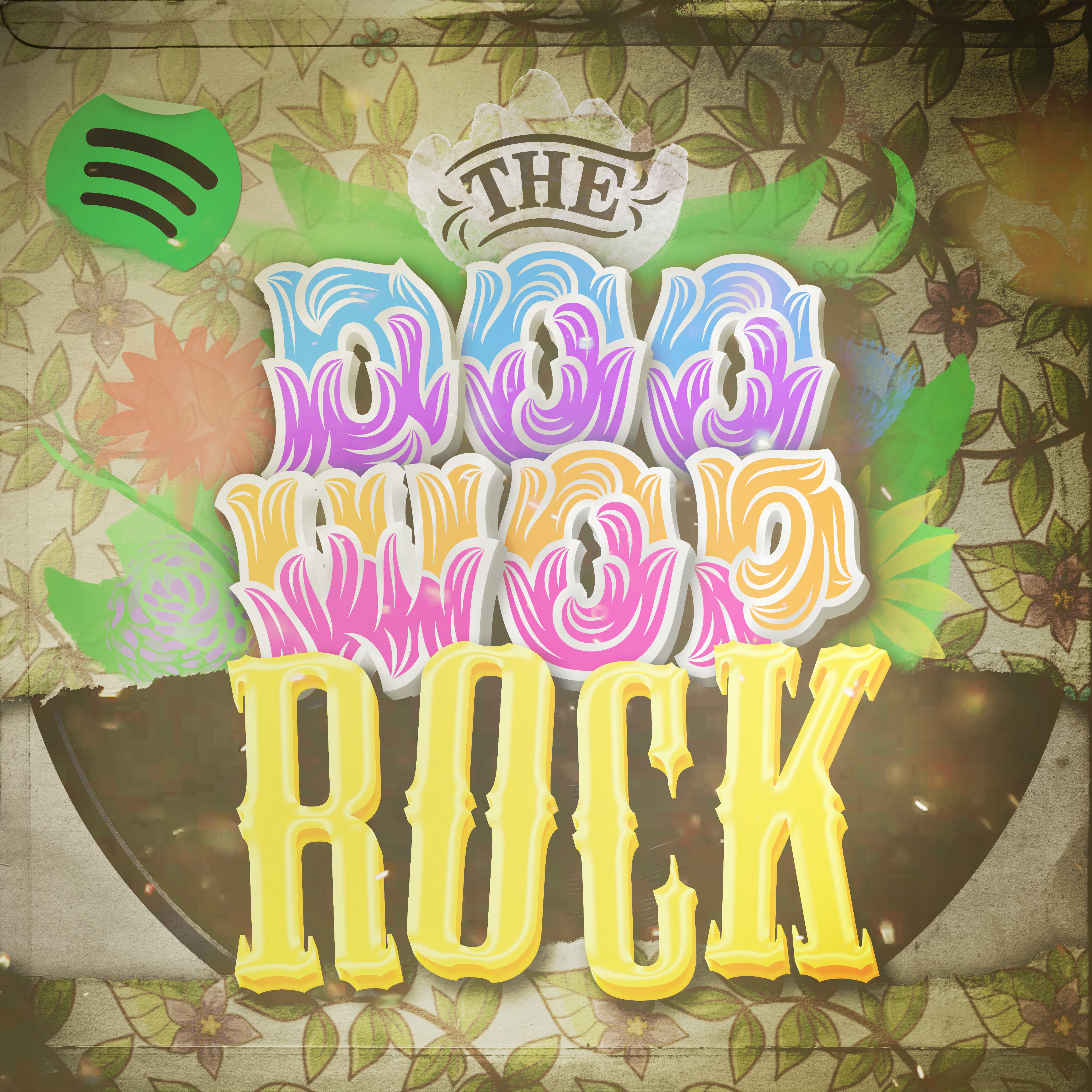
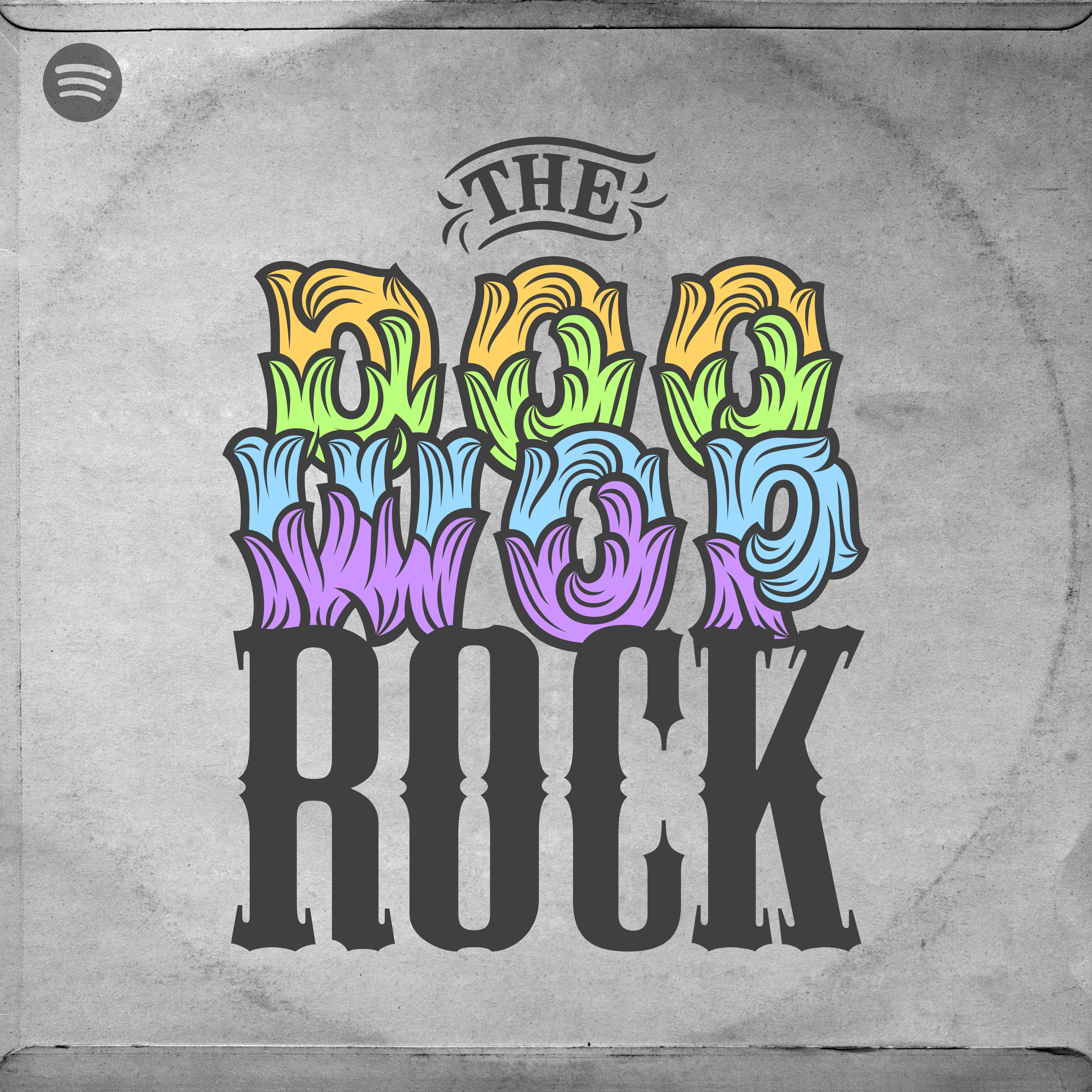
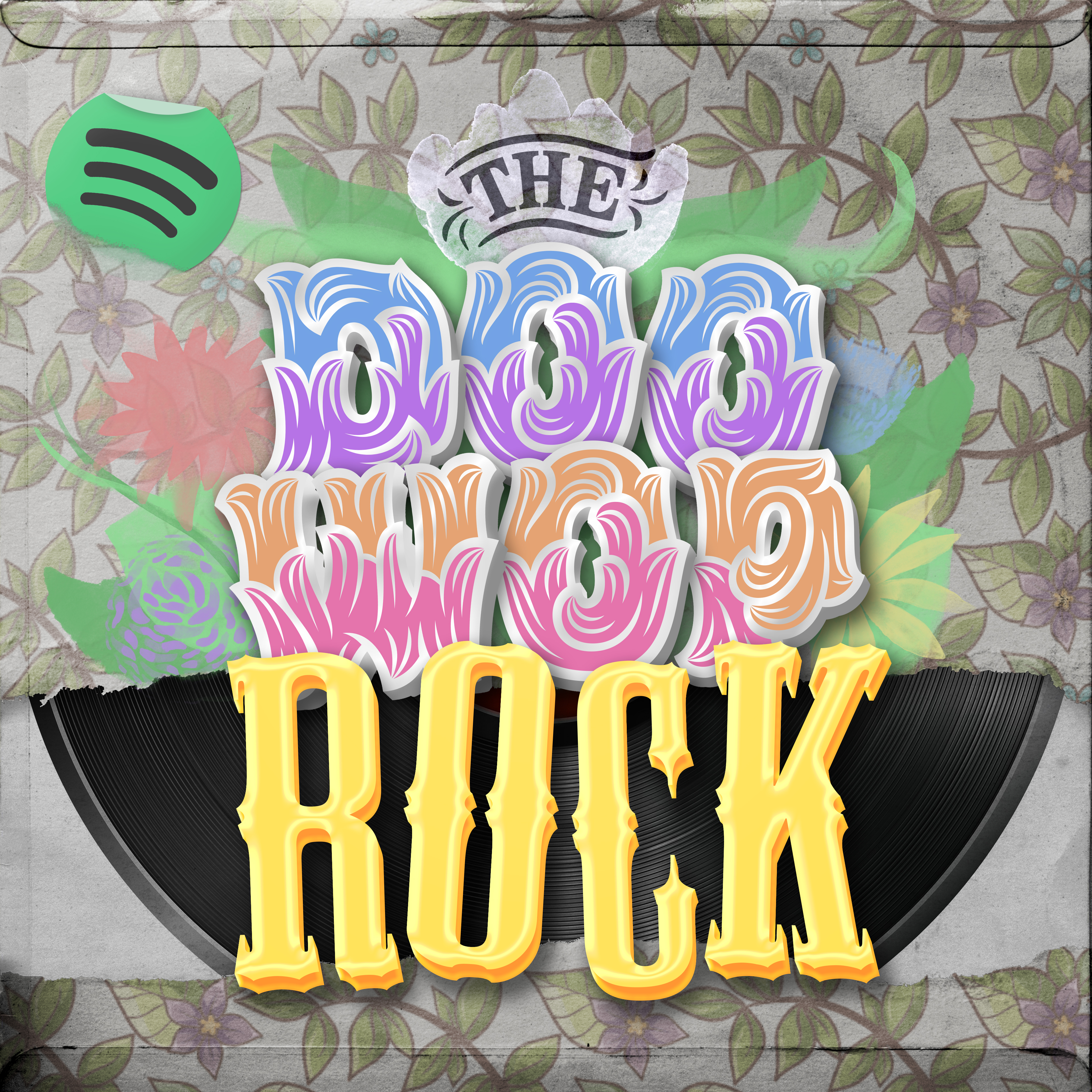
This playlist of old-school rock ‘n’ roll needed to incorporate an old vinyl record and hippy flower designs. The two different fonts used reflect the qualities of the music rather well, with one representing flamboyance and the other rebelliousness.

Adding dirt effects and a desaturated flower pattern helped create an aged look of the record cover, and the soft pastel painted flowers subtly balanced that by making it look more extravagant and exciting. To keep with the theme of a record cover, the Spotify icon was made to look like a store’s price sticker, with a fold and rip to give it some age.

A ripped paper effect was also used to emphasise the care-free spirit of the era, revealing the record inside. The colour temperature was then shifted toward tungsten to make it feel warmer and more cheerful, before adding a vignette and particle effects for a dramatic finish.

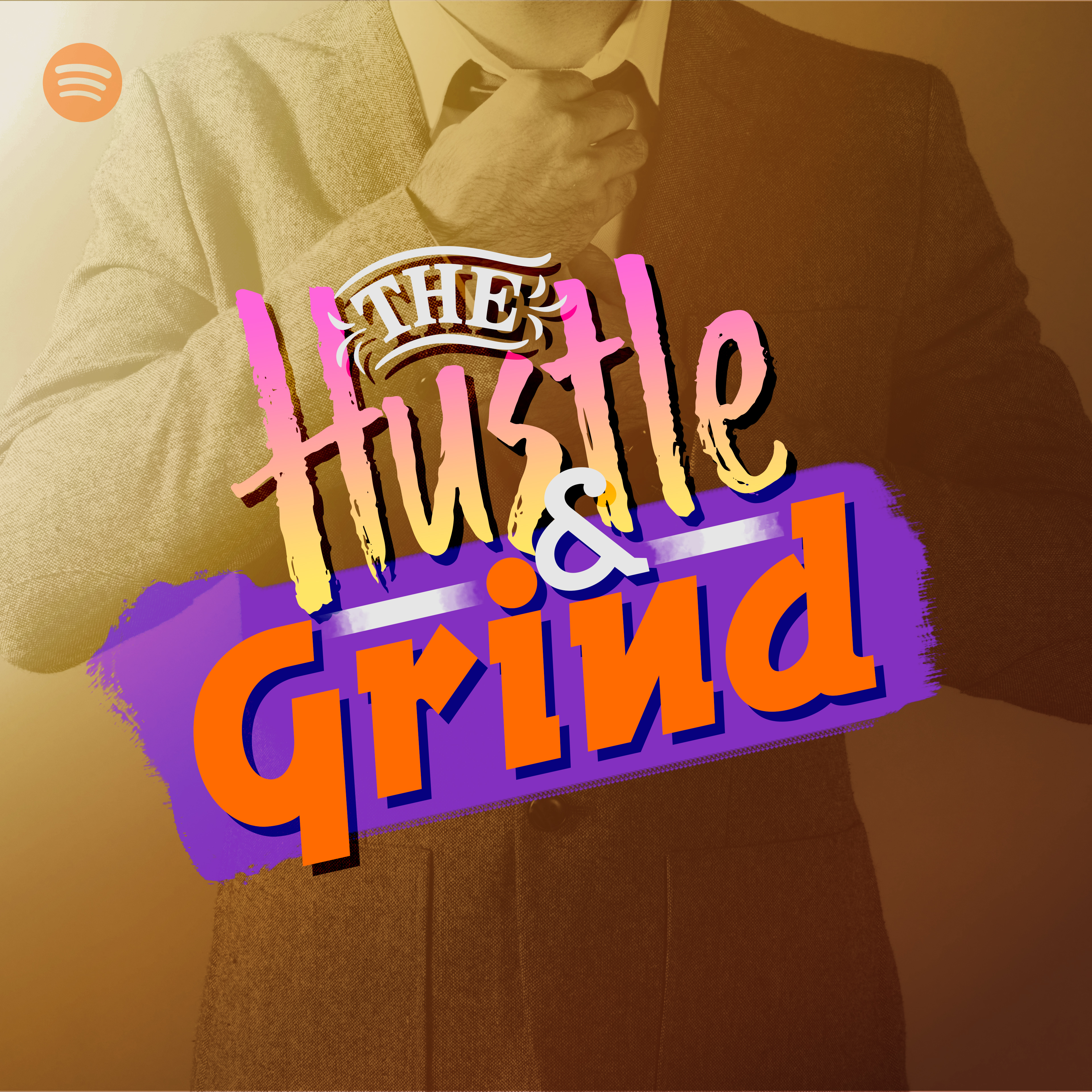
The Hustle & Grind

Listen on Spotify

“Swing your way into productivity and creative madness with a bustling mix from the likes of Parov, Goldfish and Karminsky.”

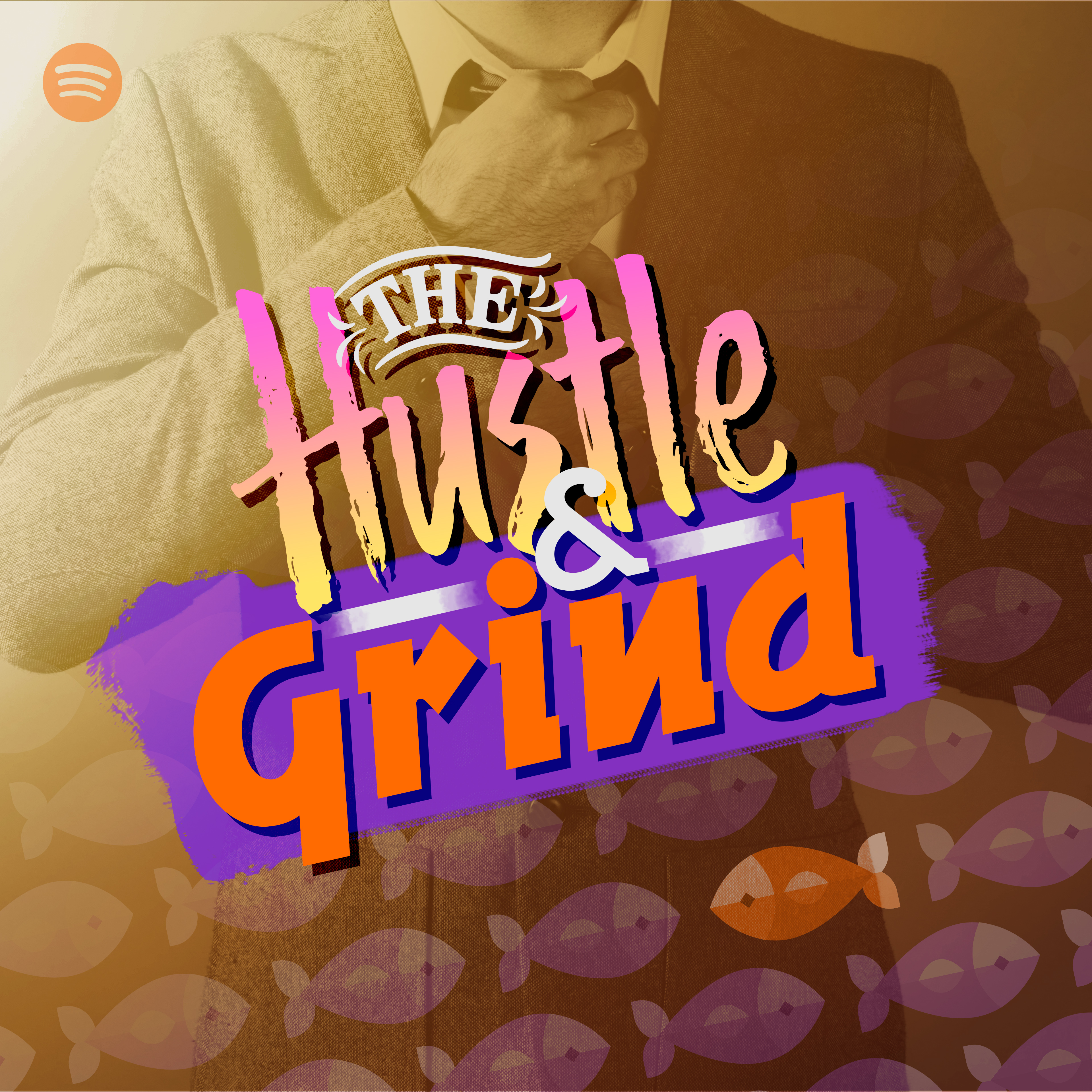
The purpose for this playlist was to inspire creativity and encourage productivity and so the tracks couldn’t contain any distracting lyrics and had to be up-beat.

The image of a man in a suit resembles the daily work life and constant high-energy music of the playlist. The quirky and jazzy musical styles inspired the use of the bold orange and purple colour scheme and the hand-written font and swipe of paint helped emphasise the colloquial manner of the music style. The fish elements added detail to the empty space and reflected the alternative nature of the music and also is a reference to Goldfish, one of the bands found in the playlist.
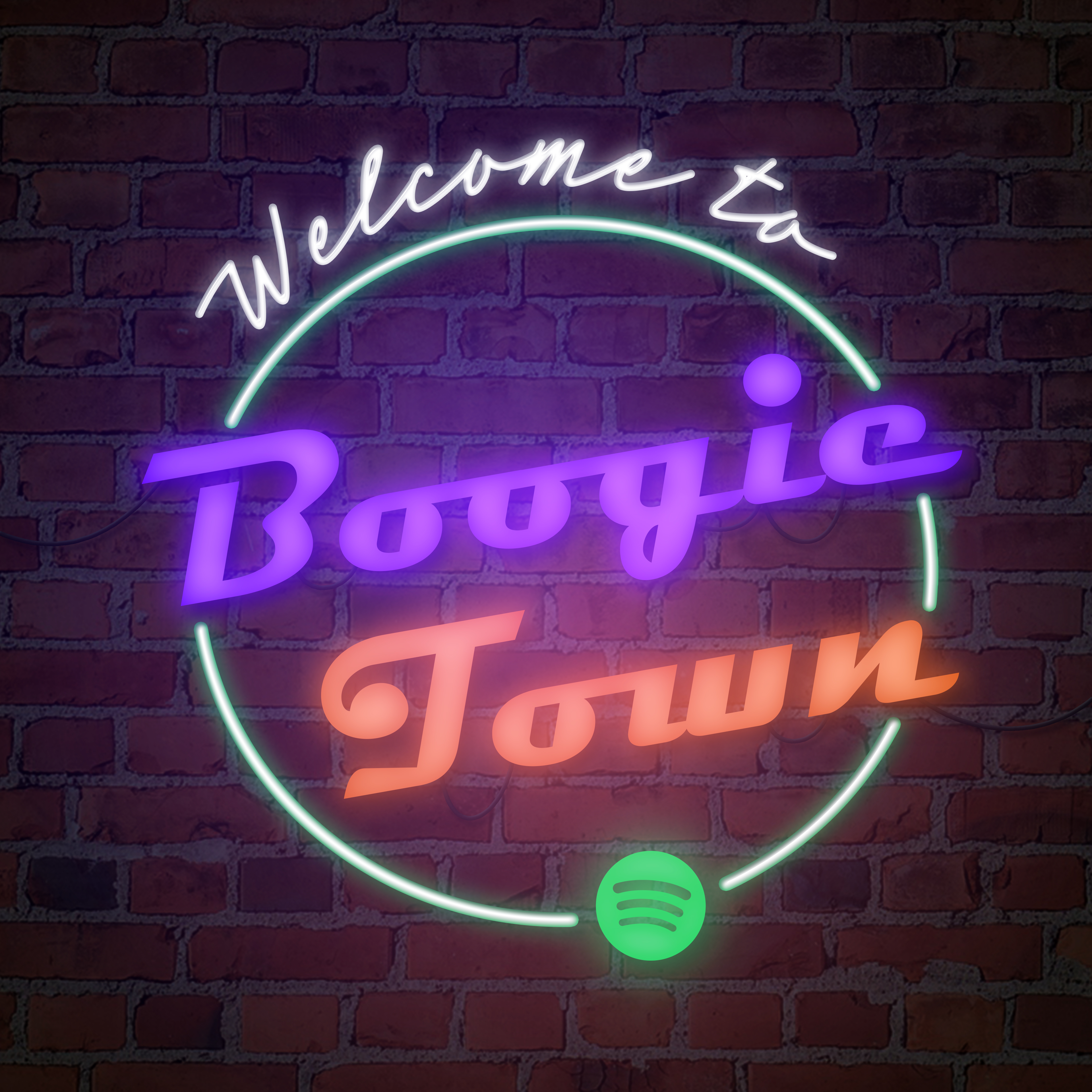
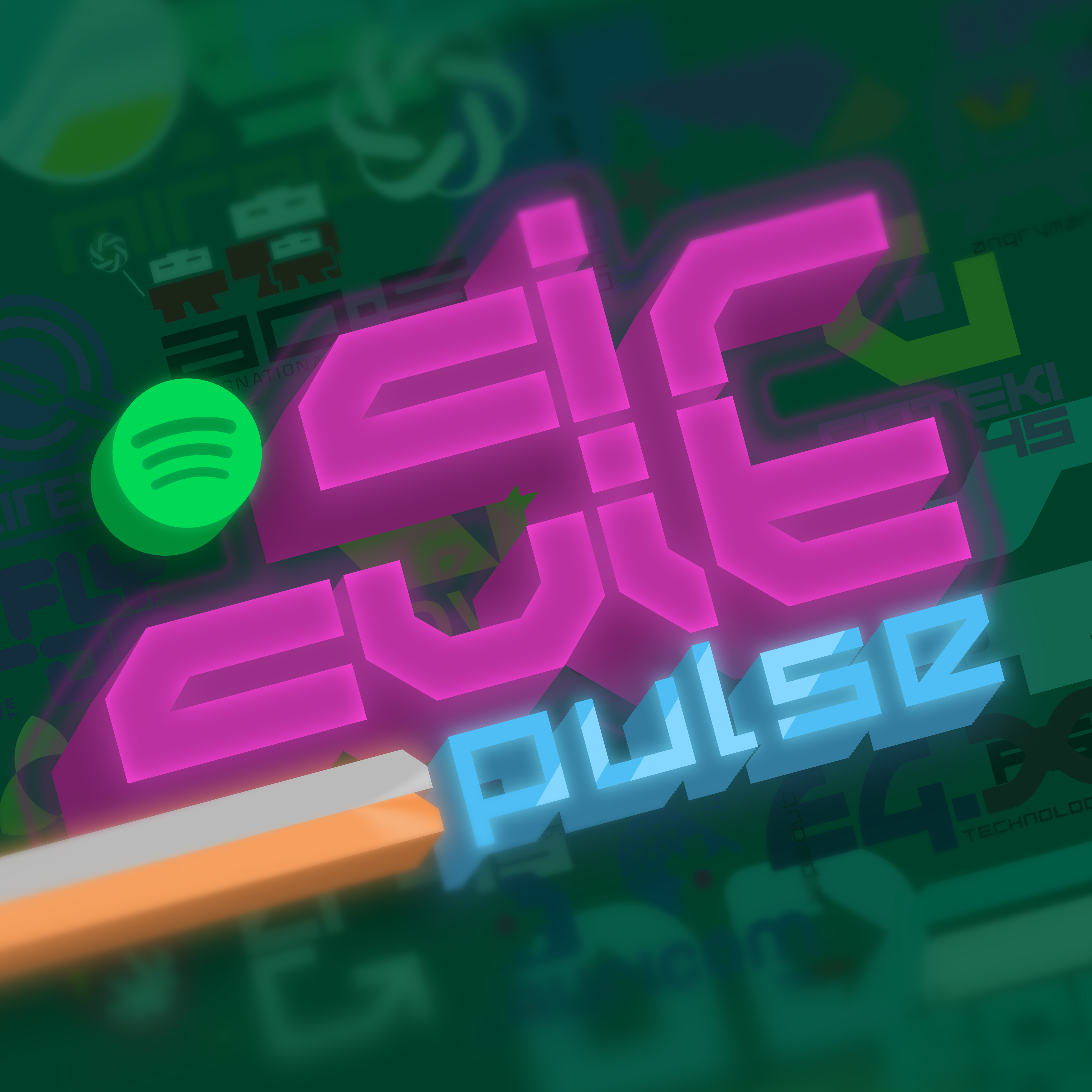
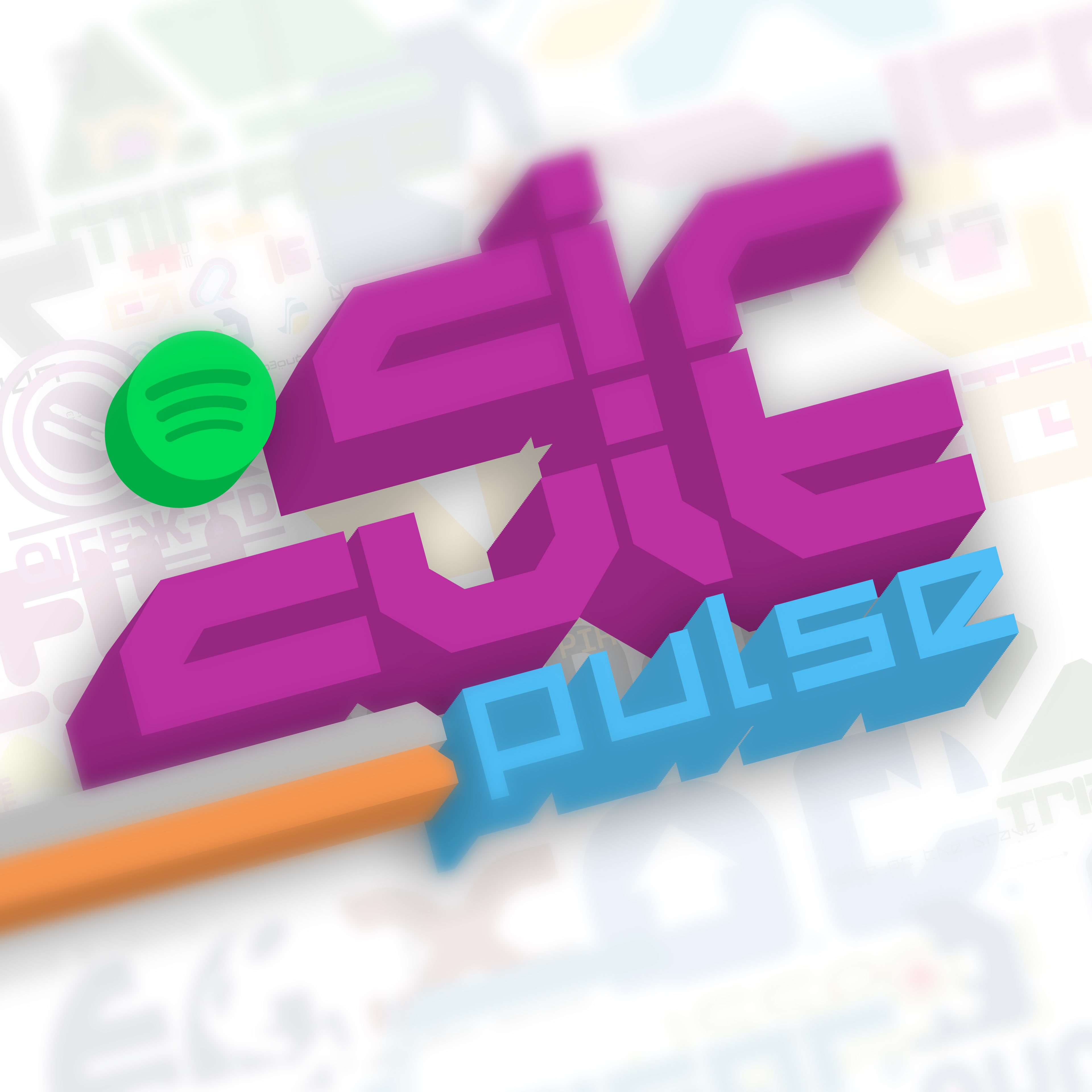
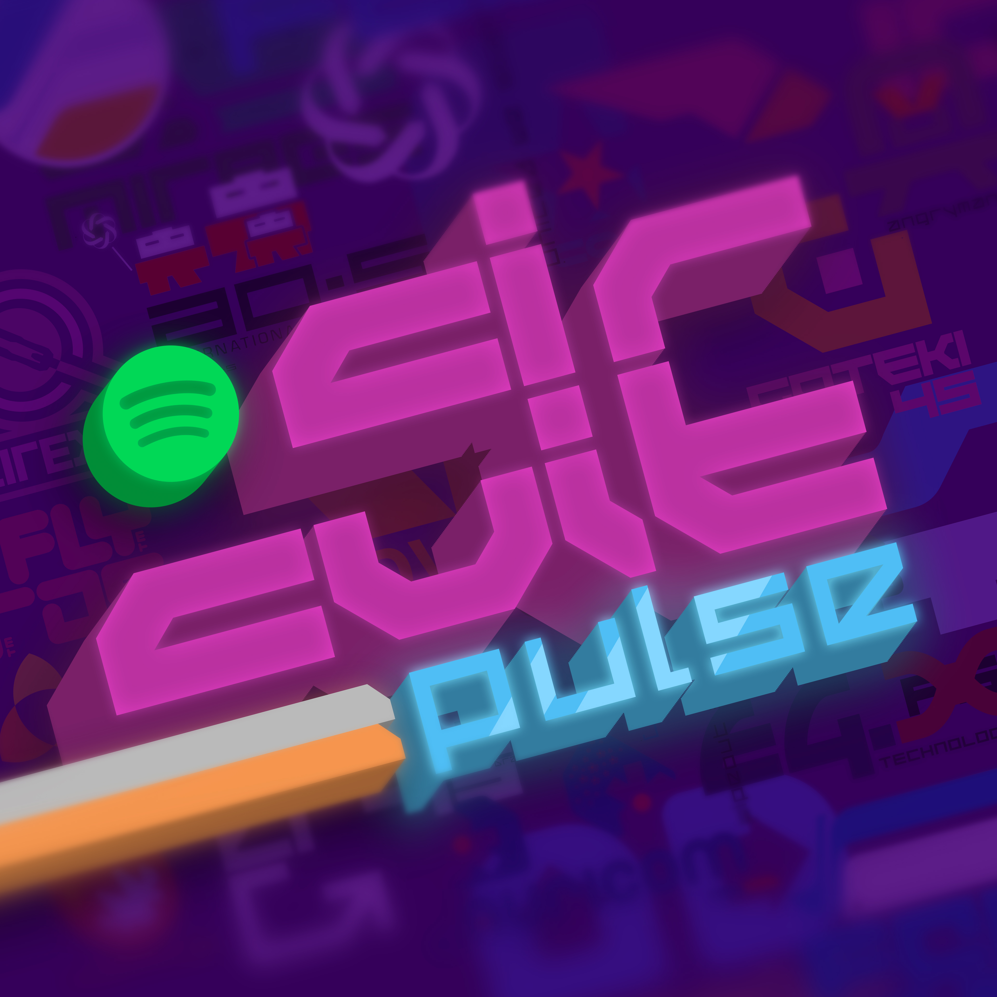
Circuit Pulse

Listen on Spotify

“Highspeed electronic tracks to keep you going in autopilot frenzy lap after lap. Featuring The Chemical Brothers, Nosia and Orbital.”

This playlist is a homage to Wipeout, a sci-fi racing game series that was known for its frantic adrenaline-fueled techno soundtracks, and so the purpose of this playlist was to gather music of the same style.

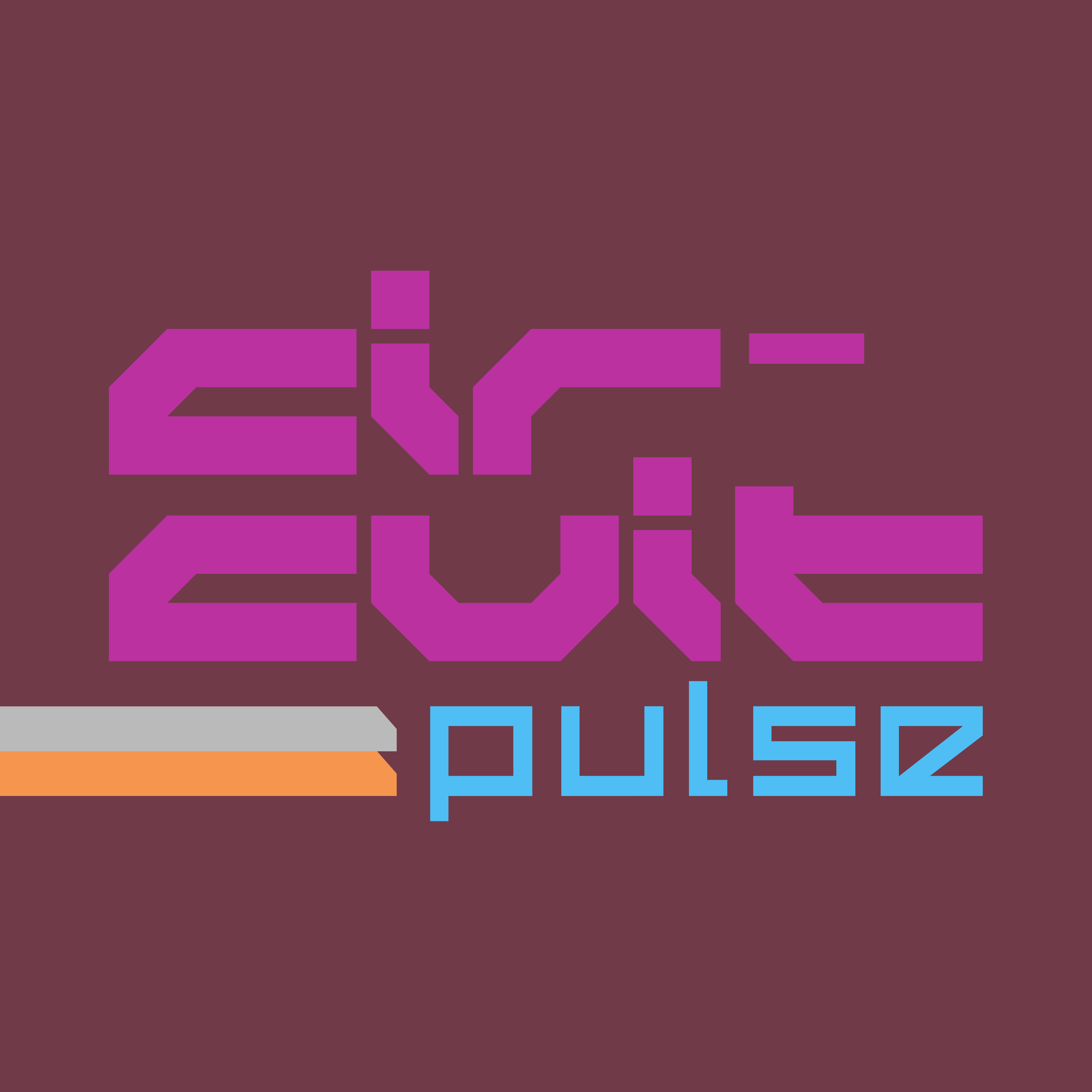
The iconic fonts used are straight from the game and the initial colour scheme was taken from in-game poster content. The twin grey and orange bars are also part of the game’s design elements and was used to fill blank space and add energy and emphasis to the text. With the Spotify icon added, they were then angled and made 3D to give it more impact and energy, and the background was then filled with design elements from various in-game poster and billboard content. A bokeh effect was then added to draw the attention away from the background to the foreground content. I then decided it needed to be darker to reflect the feel of the music, which went really well with the subtle lighting effects added after. As these tracks were more electronic and hard-techno, the background colour was changed to green to distinguish the colour palette from other playlists, which also made it look more like a circuit board, fitting the theme and name perfectly.

View the full collection below!
Thanks for viewing! ♥