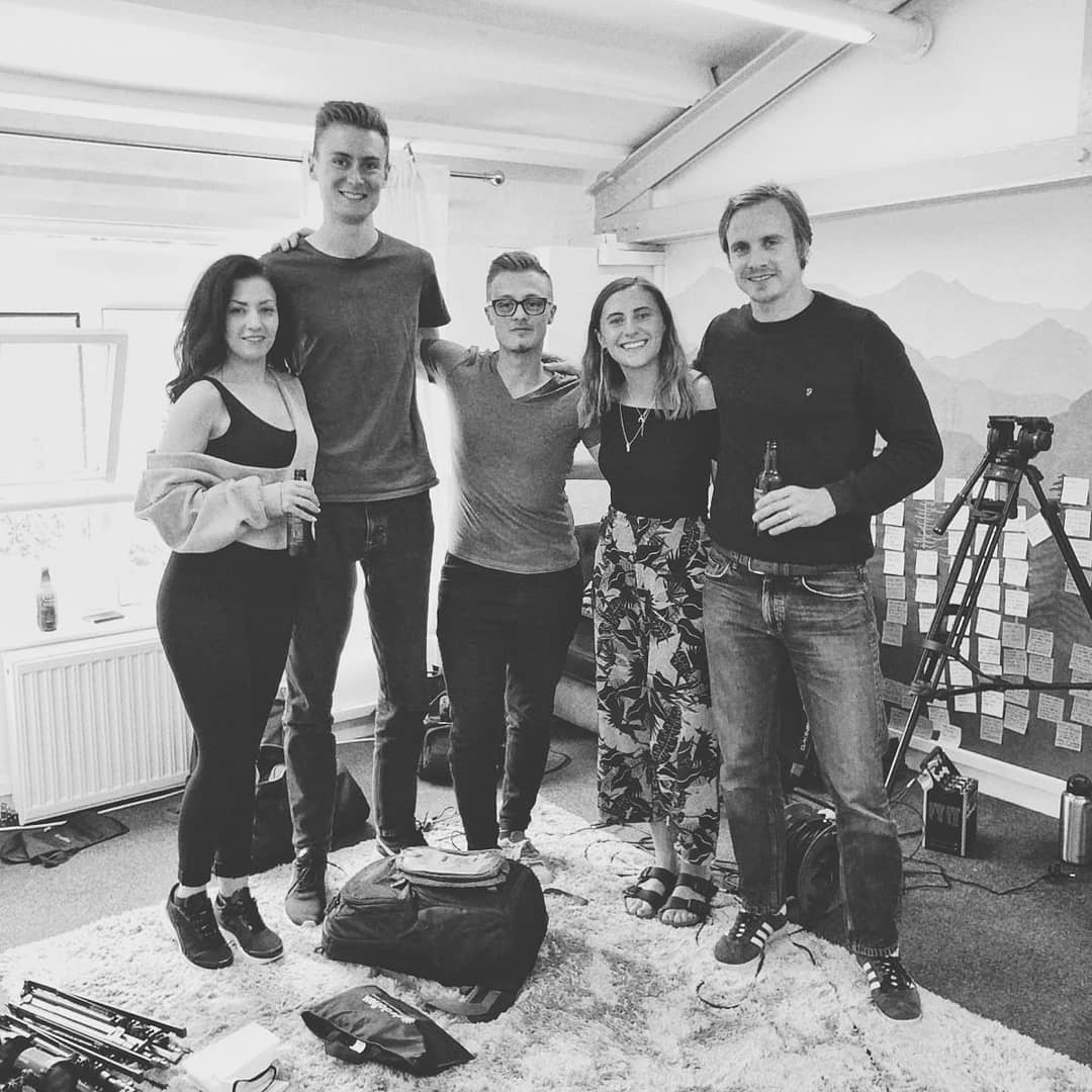
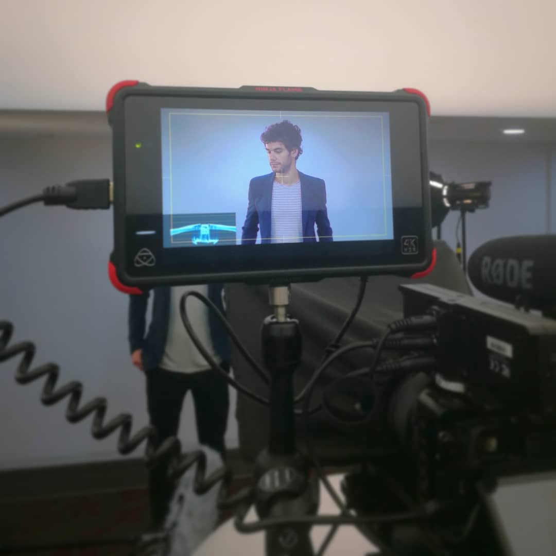
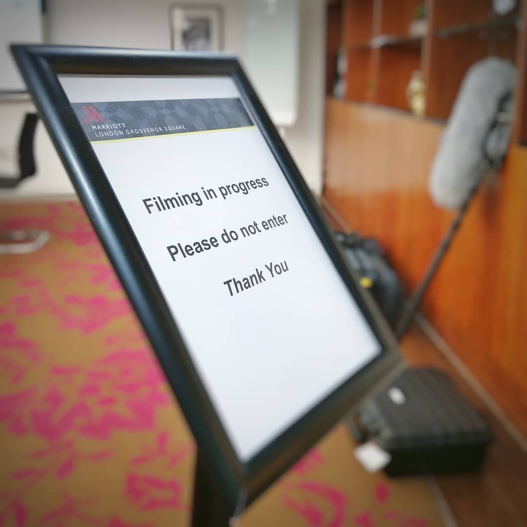
Throughout my many projects, I’ve created numerous brands to match with consistent designs, tone, imagery and more. In the summer after finishing my undergraduate course in video production, I set up Visual Storm with a friend, a freelance videography business offering various multimedia services.

Within a month the website was up and running complete with a blog and social media accounts. From some work for Marriott Hotels with Ignite, a marketing agency in London, we were inspired to return to our studies to learn more about marketing.
Visual Storm

Visit WebsiteWatch Intro

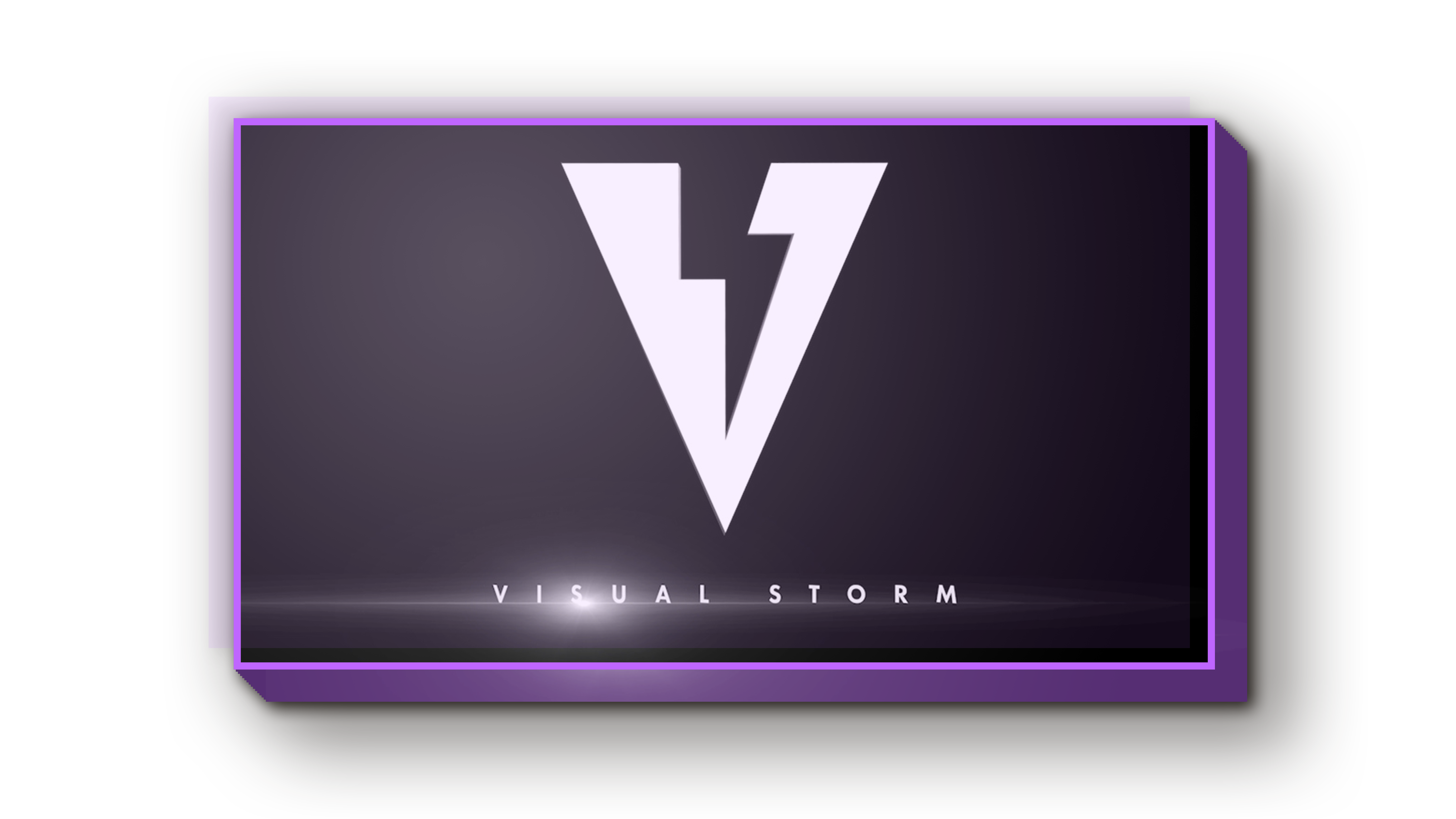
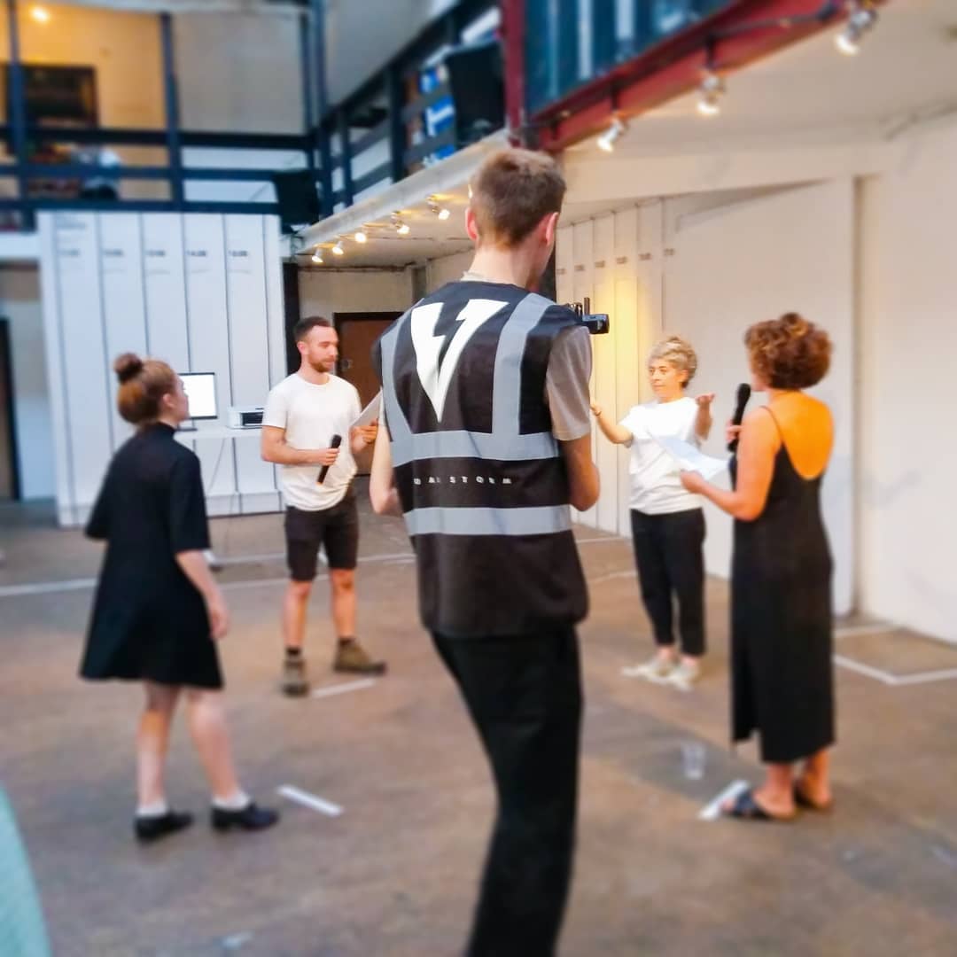
We designed the logo while studying at uni and created a 3D animated intro for the work we were producing at the time, along with branded hi-vis jackets for when we were filming on location. My friend imported out logo into Blender to create the 3D intro while I would provide live feedback and suggestions.
We then added text and a lense flare in after effects before using Premiere Pro and Audition to edit and place the many different accompanying sounds. We took our inspiration from the classic cinematic intros like Universal and Marvel, and wanted ours to set the tone for the viewer without being too gratuitous.

Over the summer, we chose a colour scheme and developed the title logo together, choosing to use custom tailored characters to suit the sharpness of the emblem.

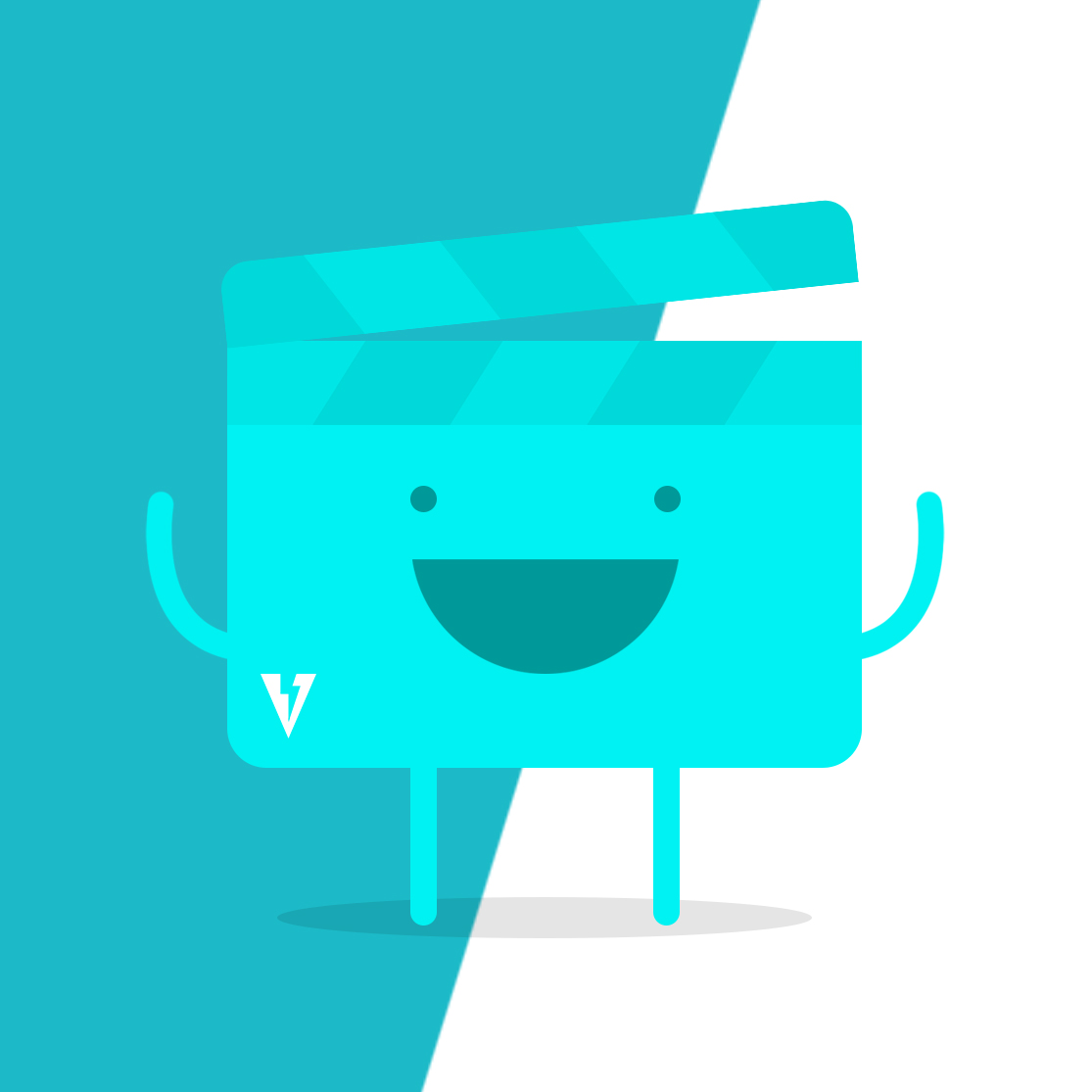
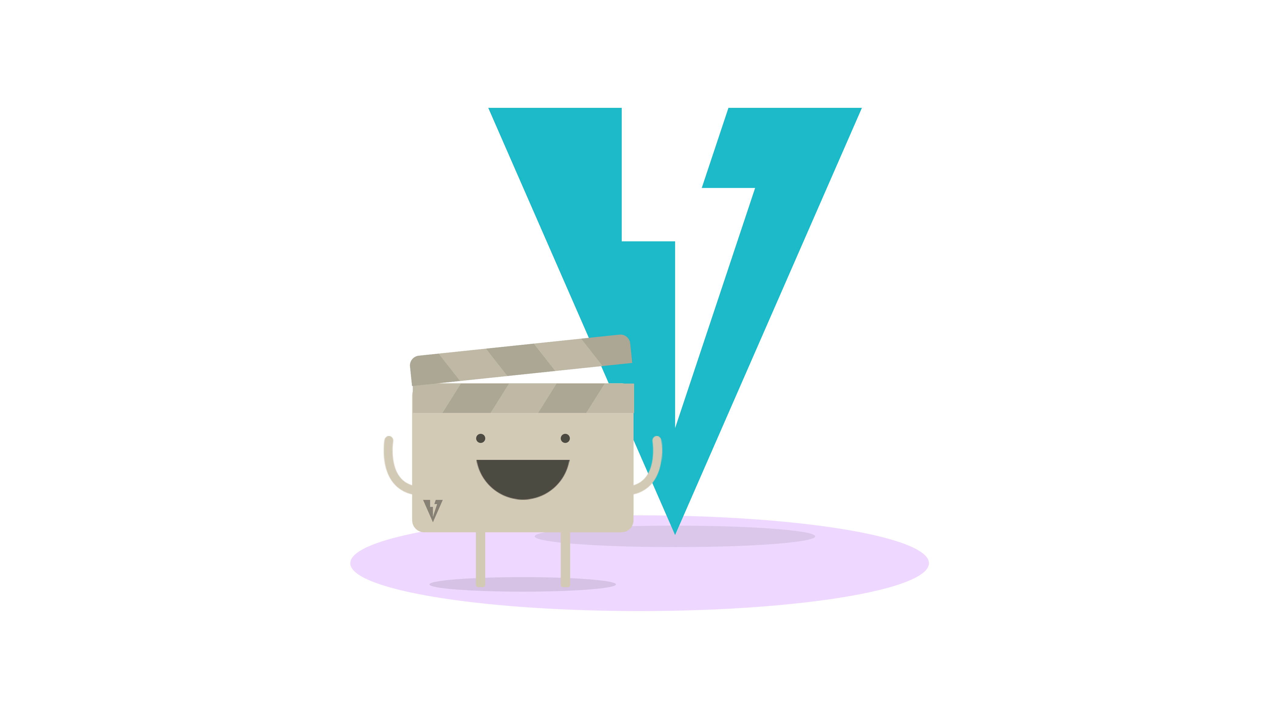
We then created a company mascot character named Slate to use for lighter content, such as business cards and social media. Some of my early mock-ups of different mascot ideas were very different to our final design. In my initial drawings, I was exploring a more friendly and casual art-style, which would have forced other brand aspects to follow suit and the brand as a whole would have ended up looking very different.

We decided to go with a more simplified design, inspired by Monzo’s Chip character. We were considering making our mascot our brand colour, but decided in the end that it would be a wiser decision to keep it a neutral colour so that it could be placed in any background.

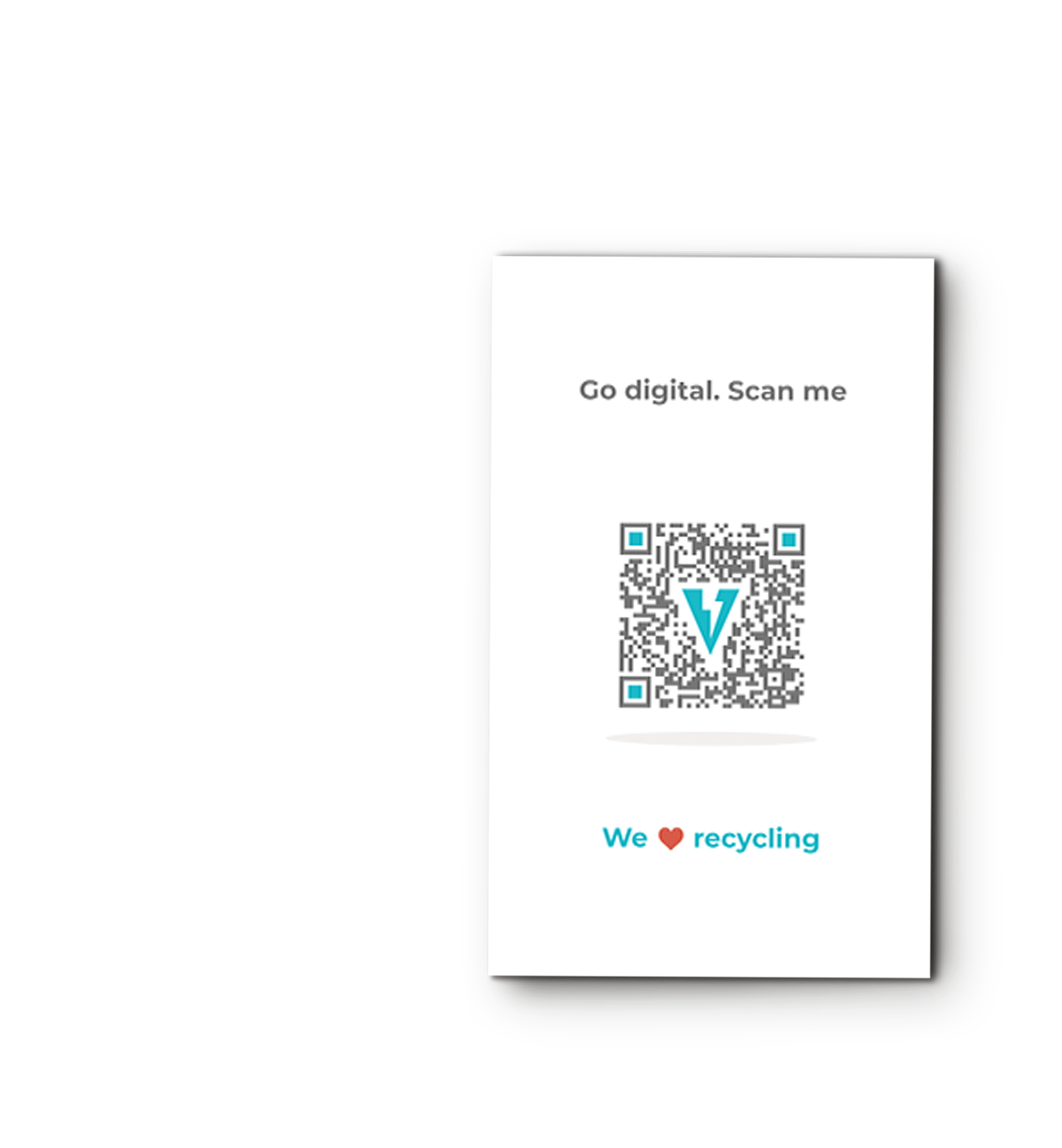
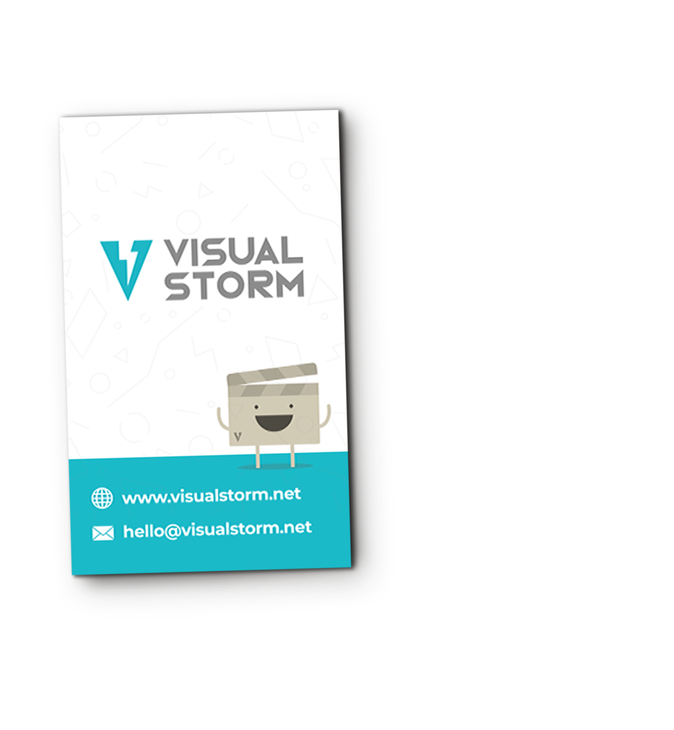
With the design elements ready, we began creating content for digital and print. As with our mascot, we took the minimalist approach with the business cards so that it looked clean and modern. We decided to design them in portrait rather than landscape to stand out from regular cards. We included a QR code on the reverse of the card to allow people to easily find out website without having to type anything in.

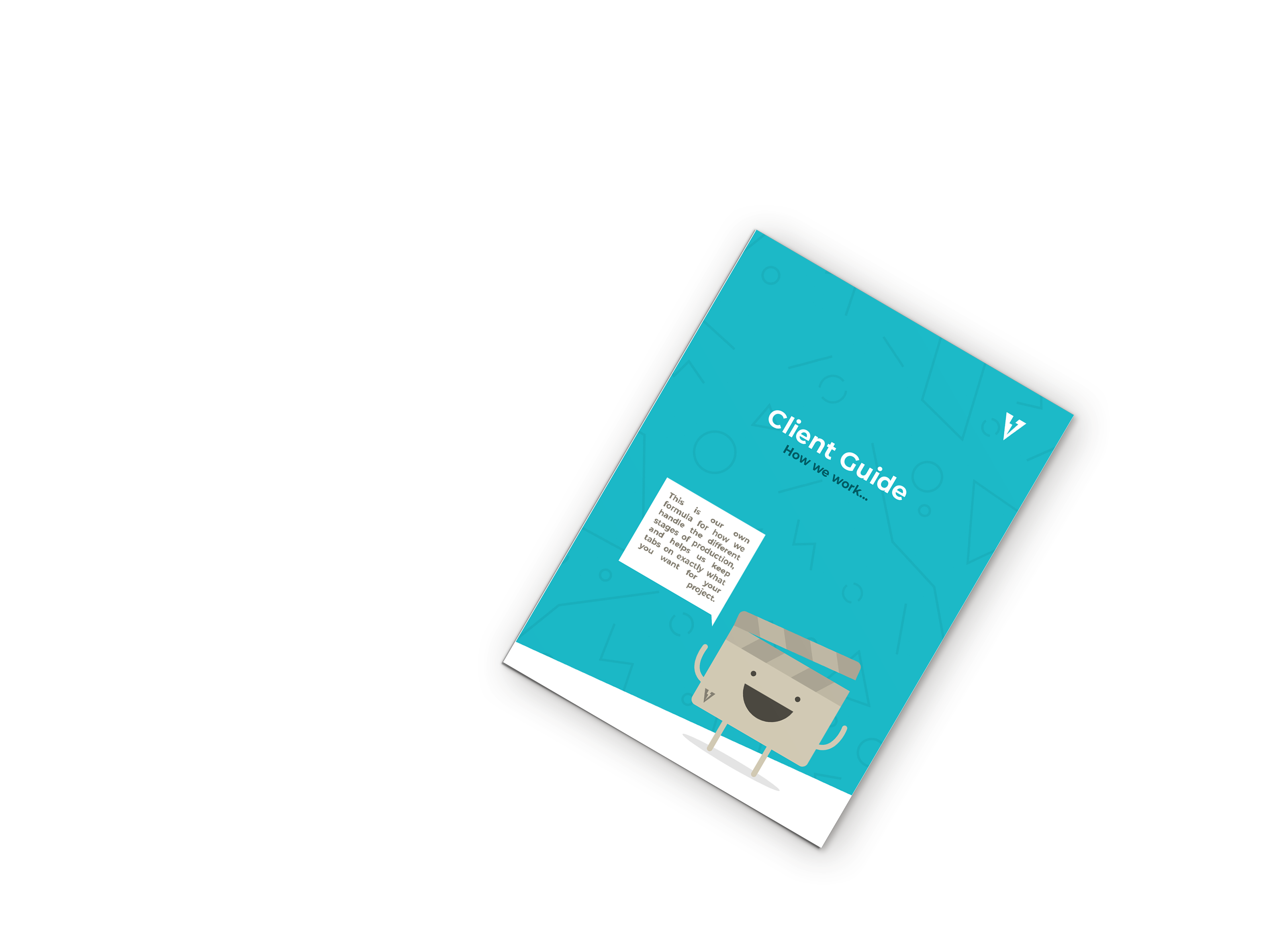
Along with business cards, we also designed a poster advert as well as a client guide to give a little more information on what we were offering and how we work with clients. These combined designs from the business card and website to bridge the gap between the two forms of content and maintain consistency.

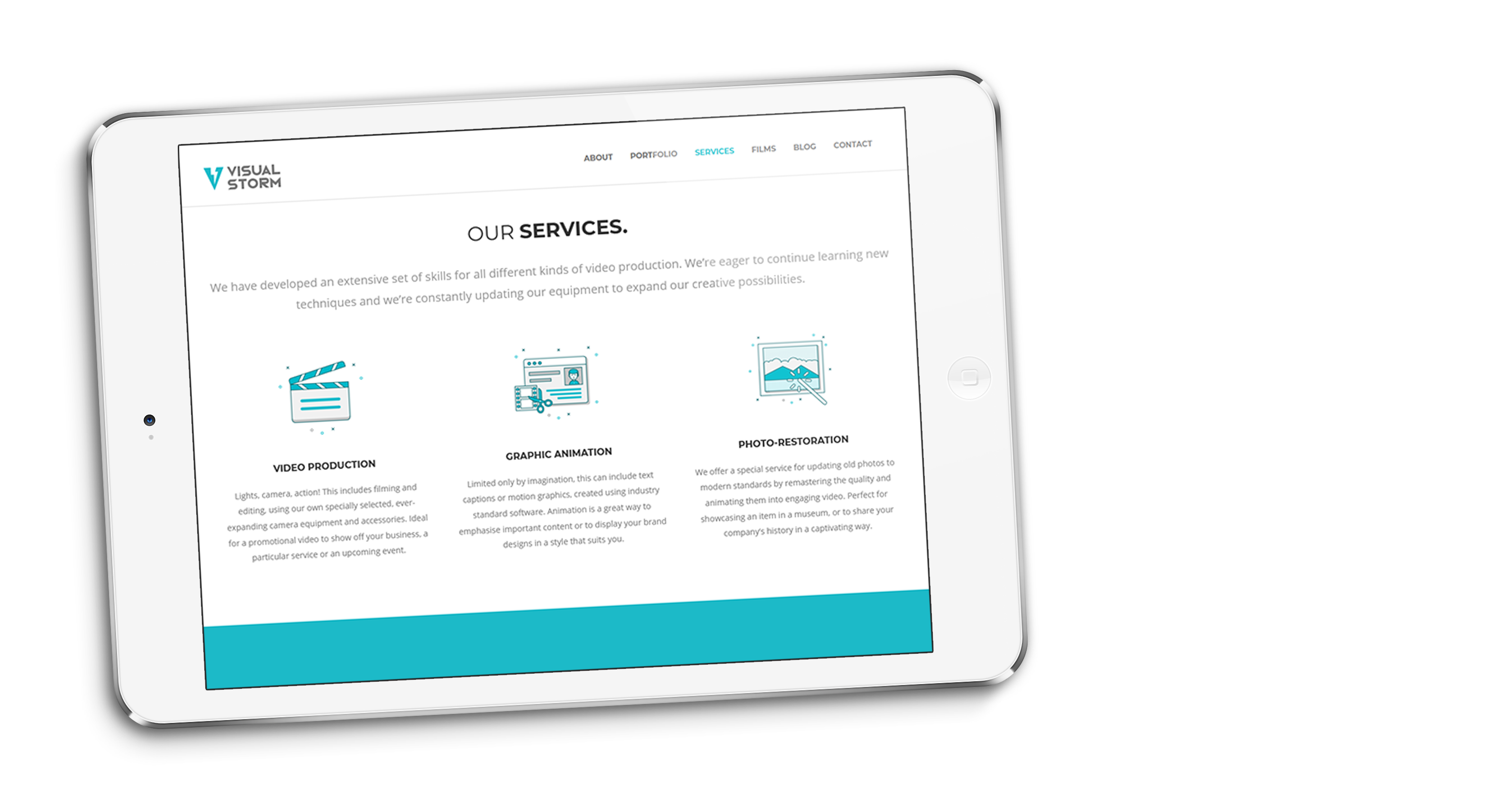
While my friend worked on the website, I focused on organising, managing and scheduling content for the blog and social media.I also performed SEO for the blog content, which included making sure headings, initial paragraphs and URL slugs contained relevant and unique keywords, as well as optimising images correctly and writing content in a particular way.

By the end of the month, our website was appearing at the top of search results, displaying our optimised preview text.

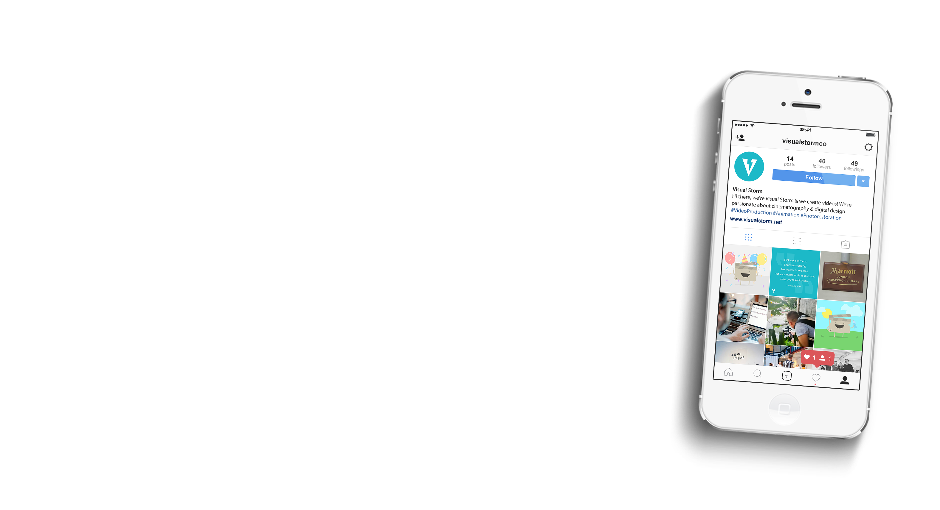
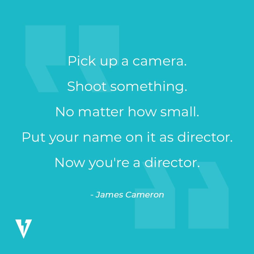
Using a shared network, I would write content and design graphics for our social media channels while my friend would also design and schedule the content using Hootsuite. We decided that we would post three different types of content on social: news updates, mascot graphics and motivational quotes.

Together, we designed templates for the mascot and quotes content and made sure that we had content ready and scheduled in so that the profile feed was balanced between content types. As we would make more and more mascot graphics, we would save any new design elements into a library to reuse in needed in the future.

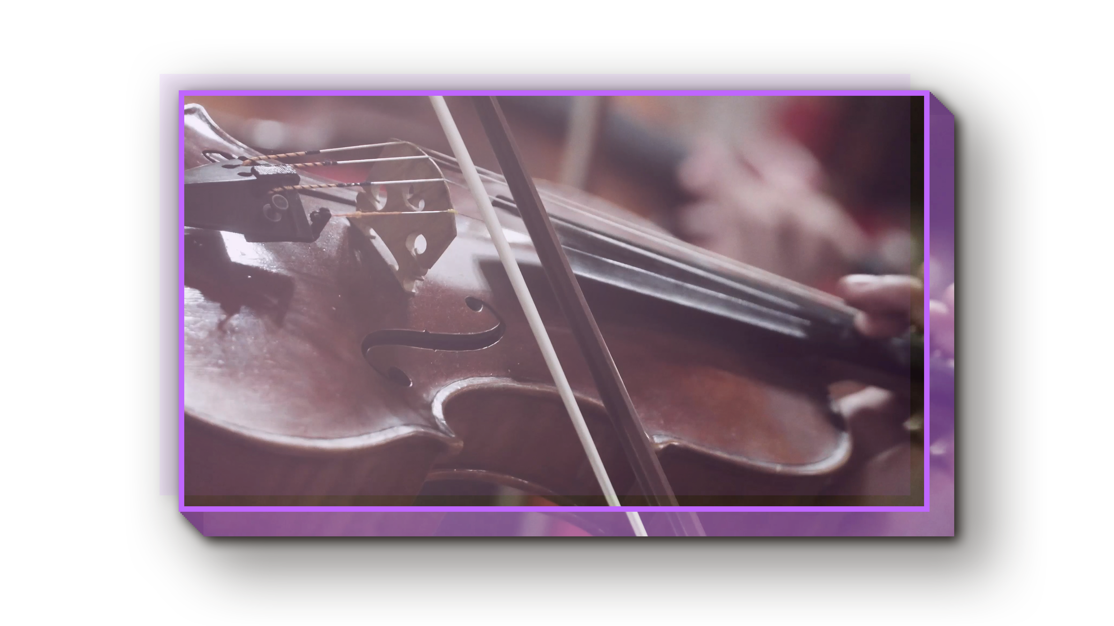
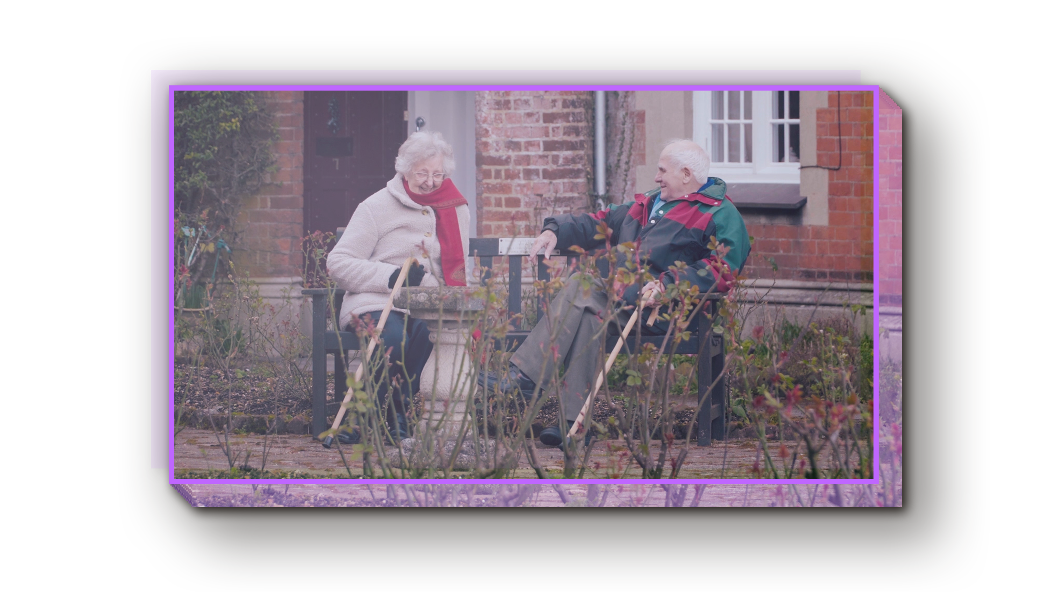
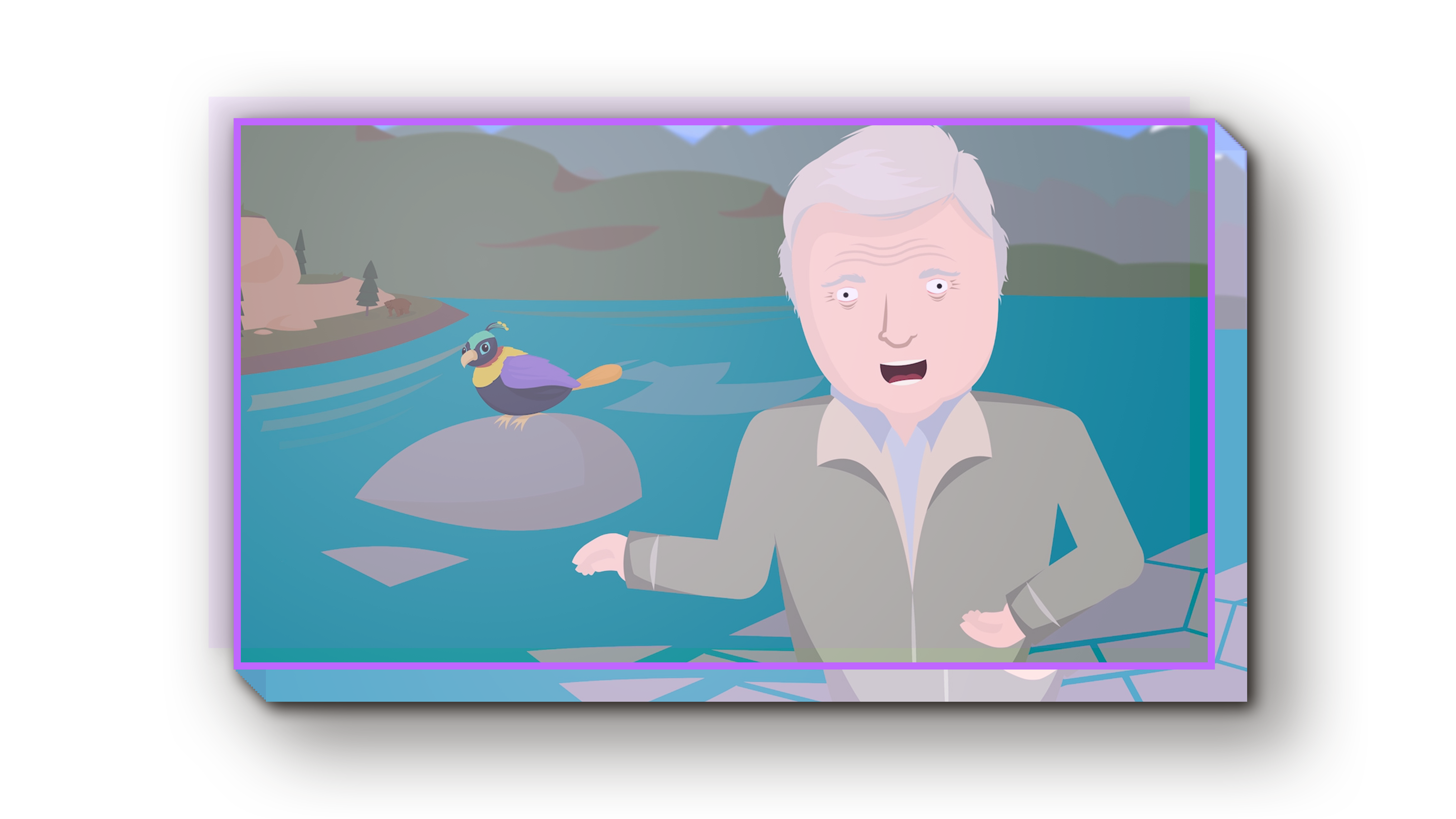
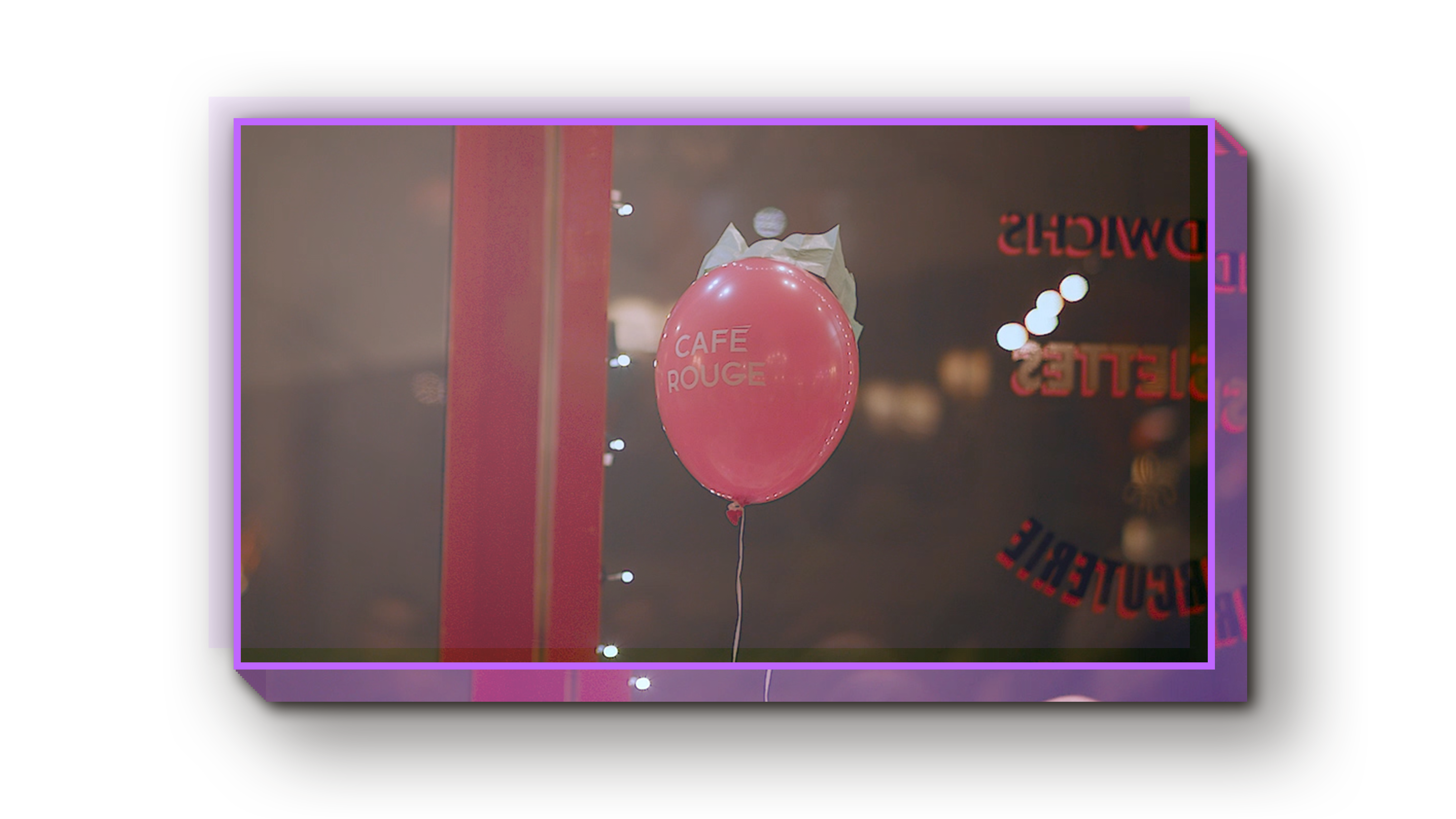
Throughout the past few years, we’ve been making all sorts of different content from short films and documentaries, to animations and promotional videos. We’ve also been lucky enough to work with Café Rouge and Marriott Hotels – see my Showreel to see more!

Visual Storm are able to respond to a brief well, coming up with their own creative ideas to ensure we're able to get what we need. They've provided us with high quality video content with a quick turn-around and represent great value for money. Their videos reached over 70,000 users online and significantly increased engagement with our Christmas campaign. The team are a pleasure to work with and I wouldn’t hesitate to recommend them.

Jonathan PeaceHead of Digital, Café Rouge
Thanks for viewing! ♥